The organization needed a new product to assist doctors with reconciling patient medications when a patient is transitioning levels of care. Based on prior experience, product management knew that the following was needed:
Review the medications that a patient was taking at home (prior to being admitted) and those that were administered while in the hospital.
Decide which medications the patient should continue taking, make modifications, or stop taking.
Verify that there are no harmful interactions among the medications or among the medications and the patient’s known allergies.
Write prescriptions as needed.
As with other applications for doctors, the product would be a tool, meaning that it had to be transparent to the user, require minimal or no training, and be hyper-efficient.
Doctors like to count clicks as a measure of usability.
I needed to respect this while also ensuring that the time and cognitive burden of finding information and taking actions were also included in the design and usability evaluations.
My role
I was the only product designer / human factors engineer for most of this project. The team also included a business analyst, clinical analyst, product manager, and development and QA teams.
This case study provides a high-level view into some of the user research that I performed.
User Research
Interviews
I began by interviewing our in-house doctors and mid-levels in order to understand the needs of this product.
What are the global workflows into which medication reconciliation is performed?
What are the tasks involved to perform a reconciliation?
What are the workflows involved to perform a reconciliation?
What has been discussed and/or tried in the past by our organization or others?
Tell me about the data. For example, what do the terms “complex meds”, “therapeutic class” and “sig” mean and how are medications typically displayed.
Advisory panel discussions
The physician analysts already had regularly-occurring customer advisory panel meetings. I began leading parts of these meetings in order to ask questions, get group feedback on concepts and workflows, and elicit requirements.
Contextual Inquiry
In collaboration with a physician analyst, I did site visits to observe doctors in action, to better understand their environment, workflows, and goals. We observed:
A stressful environment full of interruptions by other clinicians, patients, and family members. We needed to design for a user who will need to stop and come back while performing any task.
Doctors care for many patients, and those patients change throughout the shift, and a patient's status can change at any time. We needed to make it clear what patient was in context and make it easy to switch patients.
Doctors don't get breaks and rarely even sit down. They are short on time and need solutions that are transparent tools, that take the minimum time, help reduce errors, but also not overly constraining since the doctor will always know more than the software.
Notes scribbled on paper and frequent screen switching. We needed to discover what supporting data was needed to make the decisions required during reconciliation.
User Scenarios
I wrote user scenarios to clearly express what I had observed and learned, and reviewed them with clinicians and other stakeholders to validate, make adjustments, and discover new details.
Task Analysis
I performed task analysis to better understand and validate the steps involved and data needed for each action.
For example, when ordering a new medication, how do you find that med in the system, select a option that is covered by the patient's insurance, and screen for interactions? If there are interactions, what information do you need to make a decision?
Workflow Analysis
I created workflow diagrams to clearly express and validate the critical workflows involved, along with how these fit into the global workflows.
For example, what are the launching pointes to begin or resume a reconciliation? How does that tie into writing a prescription? Who get notified of any changes?
Sketches & Wireframes
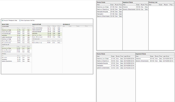
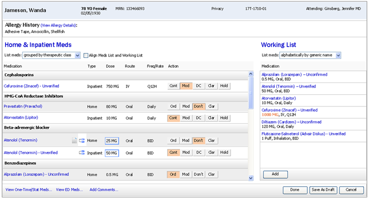
One of the initial design decisions was how to present the medications taken at home and taken at the hospital, along with the doctor's decisions on what meds to take from this point forwards?
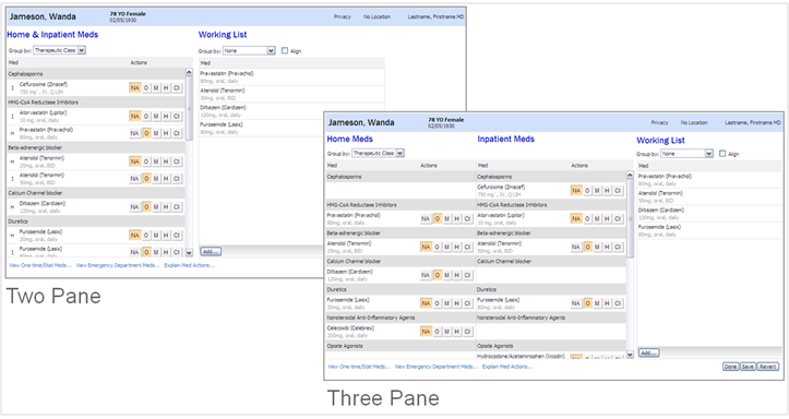
Is it better to use three columns, one for home meds, one for hospital meds, and the last one for the new plan?
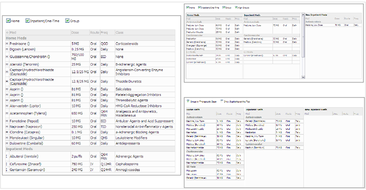
Or should the home and hospital meds be in the same list?
And if the meds are in the same list, how should the meds be grouped and sorted?
Iteration 1: The initial prototypes were high-level and low-fidelity and focused on three variations of the medication list.
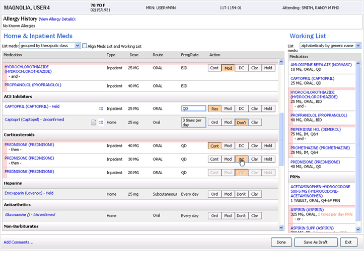
Iteration 2: Details were added to the medication lists and different methods of sorting and grouping the medications were explored.
Prototyping
I evolved the wireframes into prototypes - some low-fidelity and others more high-fidelity depending on what was being evaluated. As the project progressed, I created interactive prototypes to explore the interactions and workflows.
Some examples are evolving the visual hierarchy of the data since there was a lot of information for each med. Another was determining how to display the final list so that it was absolutely clear what changes were being made.
I used a variety of tools such as paper, whiteboard, balsamiq, Axure, and HTML / CSS. My approach is to use whatever tool can help me get valid feedback the quickest, and to ensure that usability participants don't get distracted by too much or too little fidelity, depending on the goal.
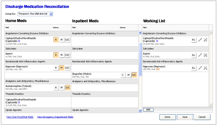
Iteration 3: Tested the actual workflow using real data. The user was asked to perform a Discharge Medication Reconciliation. Explored button labels, and began to look at dialog boxes that were spawned from the application window.
Iterate & Collaborate
Designing a complex solution such as this takes many iterations of design and feedback.
In addition to getting feedback from users, I was in constant communication with product management and development to ensure that we all had a common understanding the goals, the design and the intent of the design, and to make tradeoffs in order to meet the technology and business constraints.
Iteration 4: Performed a comparison test with two different layouts of the application.
Usability Testing
Formative Testing
The earlier usability sessions were formative in nature, where the participant was asked to simulate performing tasks on wireframes or prototypes. Data was gathered through observation and a lot of open-ended discussion.
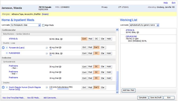
Iteration 5: Brought together input from formative testing, best practices, and user interface standards.
Iteration 6: Focused on three scenarios and explored how to indicate related order groups.
Summative Testing
Later on the usability sessions were more summative, where the participant was asked to simulate performing tasks on interactive prototypes. Data was gathered through observation of time to complete a task, task completion percentage, errors, and focused questions were asked.
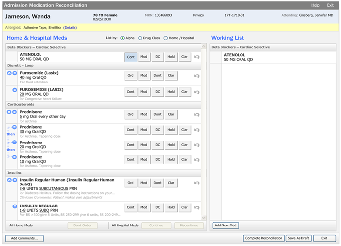
Iteration 7: Refined the design.
Iteration 8: Validated with clinicians that this format for displaying medications improved scannability and that having the additional information improves patient safety.