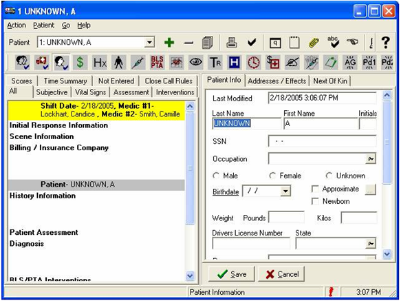
Existing product that was not acceptable.
This is one of my favorite projects since it marked the turning point in my career from development to design.
While working at a small startup in 2003, and while still a senior software engineer, the organization needed to replace a patient-data collection application for emergency medical responders. Responders hated the application because it required a stylus to input data which was almost impossible when responding on the streets, wearing gloves, and in the stress of the moment.
This was 2003 and there wasn’t much in the way of UX at the time, and no one at our organization had design experience.
Existing product that was not acceptable.
I had a growing interest in design and had just completed the Interaction Design Pracitum by Alan Cooper. I therefore eagerly volunteered to lead the design effort.
I interviewed all stakeholders to learn about the user goals and business goals.
Business goals
Customer goals
User goals
Our users, however we resistant to the any form of real-time documentation.
Environment
And as mentioned earlier, the product needed to be used in harsh environments.
This was a long time ago
Again, this was 2003, well before iPods and tablet devices existed, but there were ruggedized laptops with touchscreens, and these were our target devices. There were no existing applications nor best practices for what this project required. Everything from navigation, to methods for input, to visual design needed to be designed from scratch.
The navigation needed to
I designed a wireframe of a hybrid wizard that provided orderly entry of data within specific task, provided feedback, and allow for asynchronous navigation across tasks.
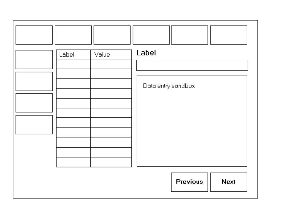
Wireframe of a hybrid wizard framework.
Next, I then created a clickable prototype and put this on the device. With this, I was able to observe internal responders act as if they were attending to a patient while simultaneously holding the device and entering data. Using this research, I defined the locations, orientation, sizes, etc. so that the system had a natural feel.
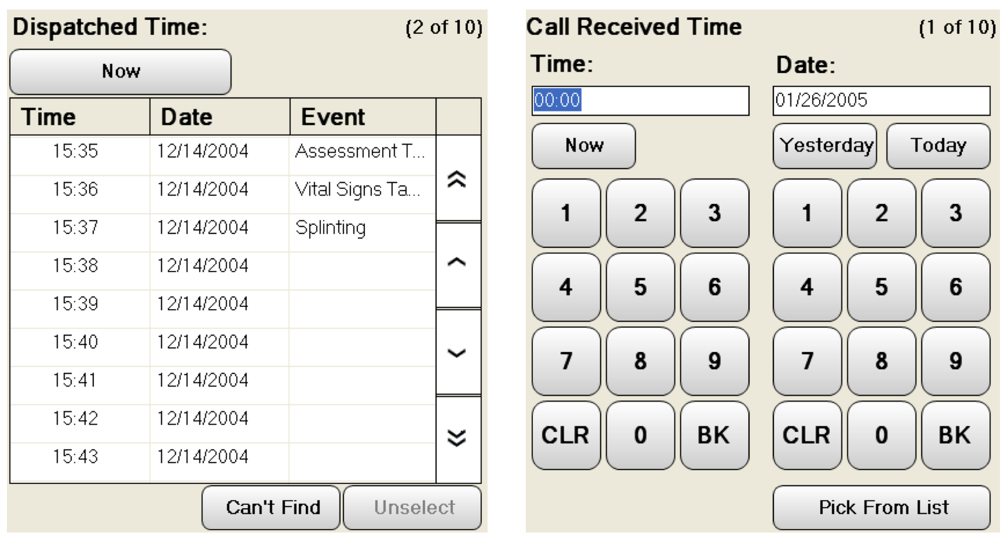
Date and Time entry widget
I designed specialized buttons for commonly selected data such as Now, Yesterday, and Today, a list of recent times along with timestamps, and the option to enter by finger or pick from a list.
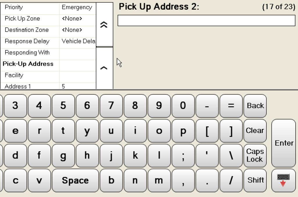
Text input widget
The soft keyboard would slide up for these fields. The soft keyboard actually had larger buttons than the physical keyboard on the Panasonic tough book – the device of choice for this application.
Final Design
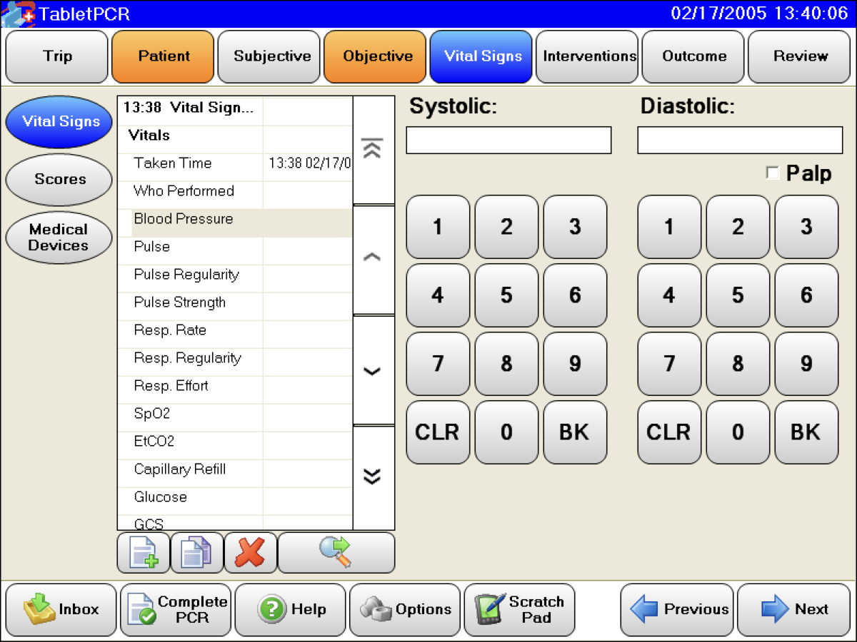
Work environment
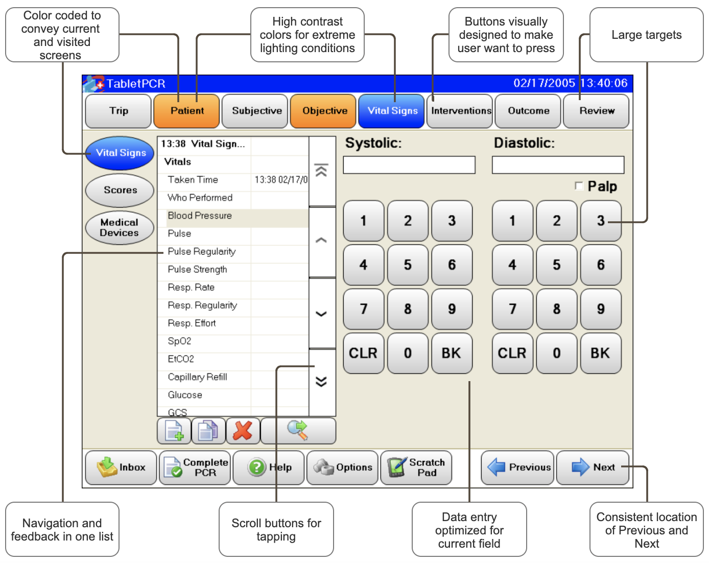
Data entry
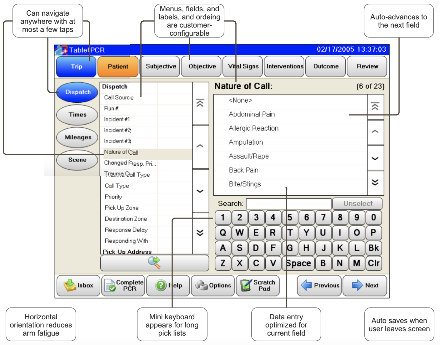
Users' mental model
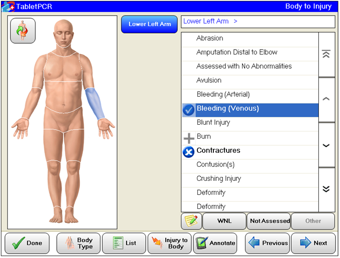
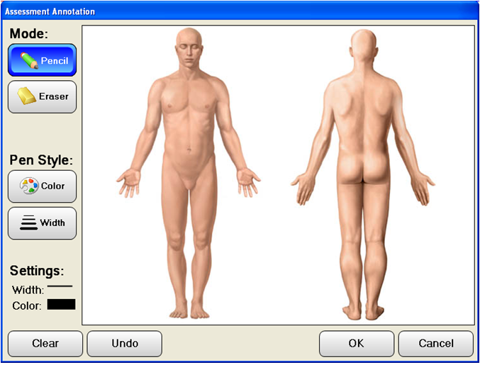
I was also one of the developers on this product, and it was a turning point in my career. I realized how much I enjoyed design and therefore decided to switch to a larger organization with an experienced design team.
This product was wildly successful. Its first year sales exceeded projections by 300%, immediately making this the company’s top-selling product.
We were receiving wonderful feedback, and our customers quickly because our best form or marketing
Given that this was my first design project, and was done in 2004, there is certainly room for improvement.