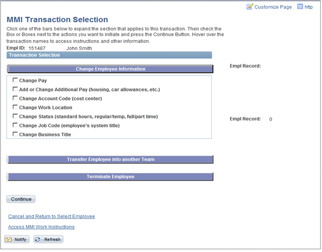
Original product: Lots of distractions and minimal functionality.
The Human Resources department wanted to improve their existing PeopleSoft solution for managing employee info so that more of the tasks could be delegated to low-level management.
Original product: Lots of distractions and minimal functionality.
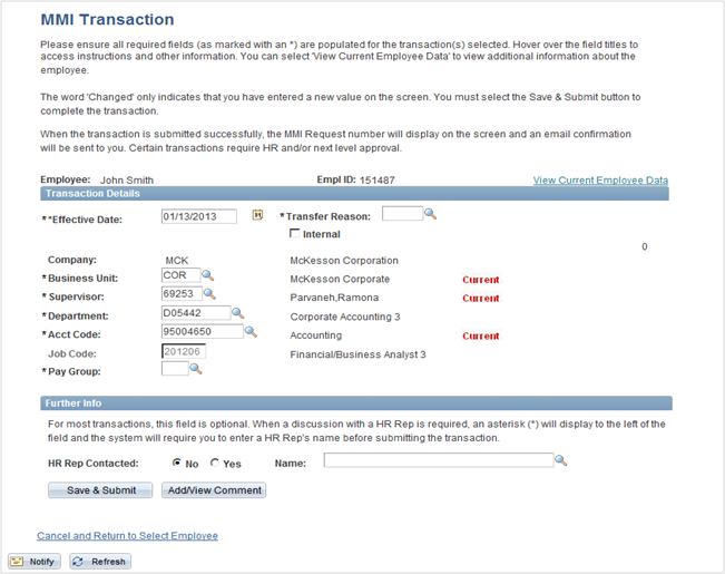
Original product: The help text took up a lot of space, but did not address the users's needs.
“I select several things, and hope that I will be taken to just what I need.”User feedback during a usability session on the existing product
I was asked by HR to suggest changes needed to meet their goals. They had in mind a wizard approach like TurboTax. I was the only designer and hand-picked subject matter experts across the organization.
This case study briefly covers the user-centered design process that I followed, the resulting solution, and usability metrics showing the improvements.
In order to understand their goals, the project constraints (timeline, resources, technologies, etc.), and to get to know everyone.
Reached out to low-level managers across the organization from different departments and with varied levels of technical experience, and varied levels of experience with the existing solution.
Defined the tasks and timelines.
Performed heuristic evaluation of the existing solution to determine how to best create scripts for user observation sessions.
Facilitated user observation sessions where I remotely observed users attempt to complete specific tasks.
At the end of the sessions, the user filled out a SUS survey to get data on the usability of the current solution.
I performed workflow analysis to summarize what I had learned and validate. These were used to inform the global navigation, workflows, and areas where online help would be beneficial.
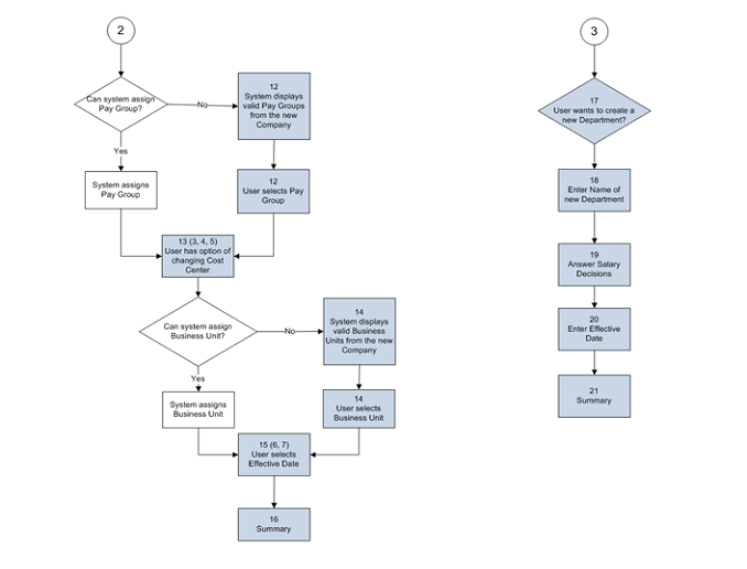
Workflow Analysis
Reviewed the results with stakeholders and brainstormed concepts for improvement.
Iteratively designed in parallel with usability testing:
Conducted three rounds of usability testing, with each round evaluating updates made based on feedback from the prior round.
Collaborated with stakeholders the entire time and invited them to be silent observers at the testing sessions.
At the end of each testing session, the user filled out a SUS survey to get data on the usability of the current design and better understand how close we were to meeting our usability criteria.
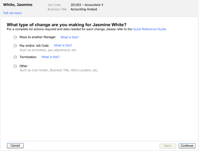
Final Product: Wizard pattern to guide infrequent users and provide help where needed using progressive disclosure.
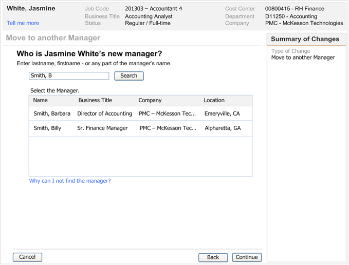
Final Product: Added a sidebar to summarize changes made, indicate where they are in the process, and navigate asynchronously.
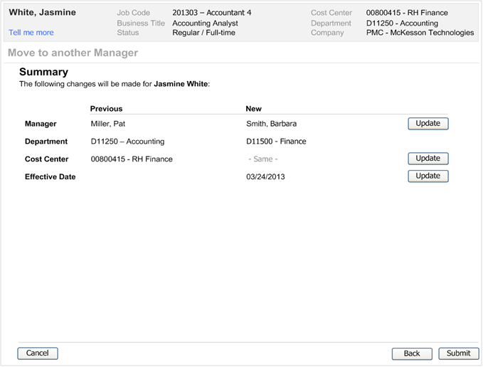
Final Product: New review page before submitting changes.
The System Usability Scale (SUS) raw score increased from 60% to 97%.
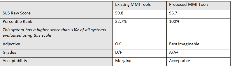
SUS raw score
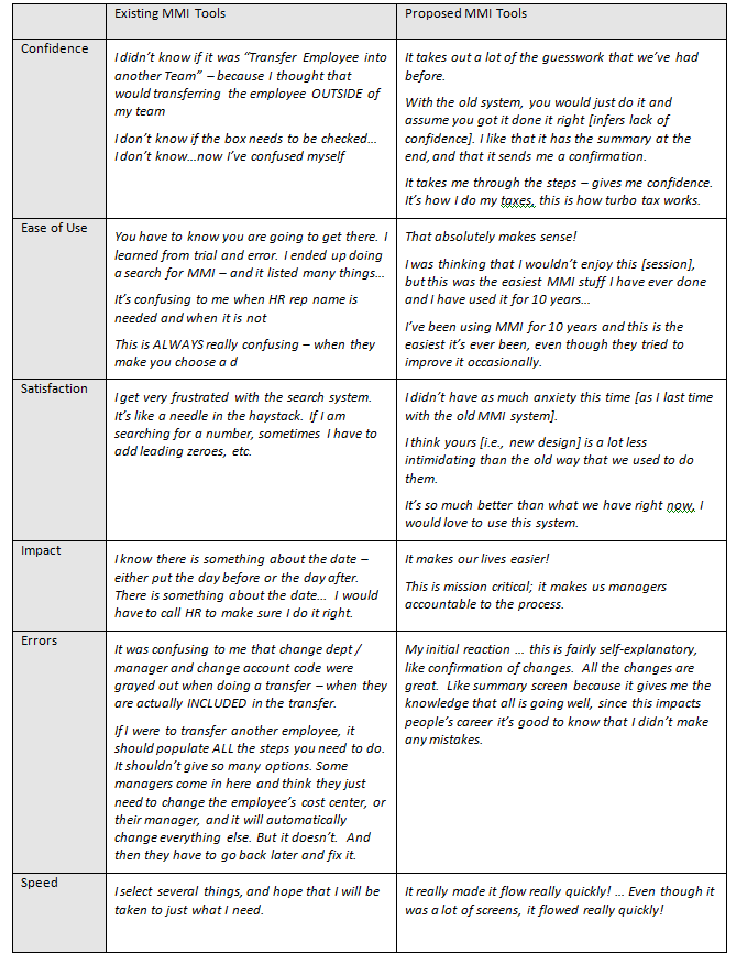
Quotes above from users
“Mark was assigned a project that required him to jump right in, while he was working remotely, with a team that he had never met before, on a domain he has never worked on before.” Charles Fusco: HR Technology Lead